

Open the Bookings dashboard
1
Log in to Cal ID
Access your main dashboard at Cal ID.
2
Navigate to Insights
Click the Insights icon in the left-hand sidebar menu.
3
Select the Bookings tab
Use the tabs at the top left to switch between analytics areas, then open Bookings.
- Bookings: Monitor overall meeting statistics and booker behavior.
- Routing: Analyze how many people are interacting with your routing forms and where they are being directed.
- Workflows: Track the success and trigger rates of your automated workflows.
Key metrics and reports
Summary scorecards
At the top of the Bookings tab, a quick summary shows activity for your selected date range.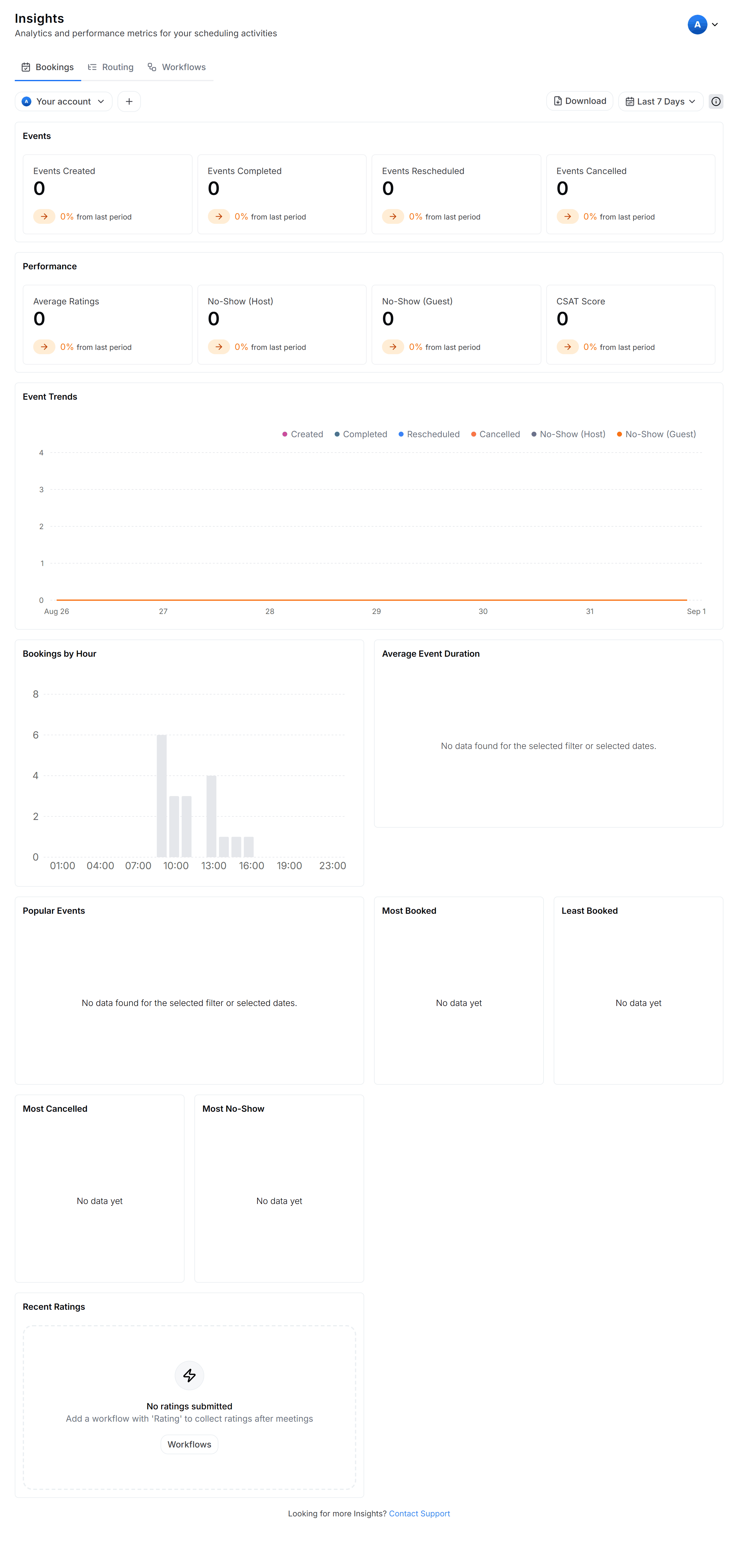
Reading your activity at a glance
Performance overview
This section measures the quality of your meetings and your reliability.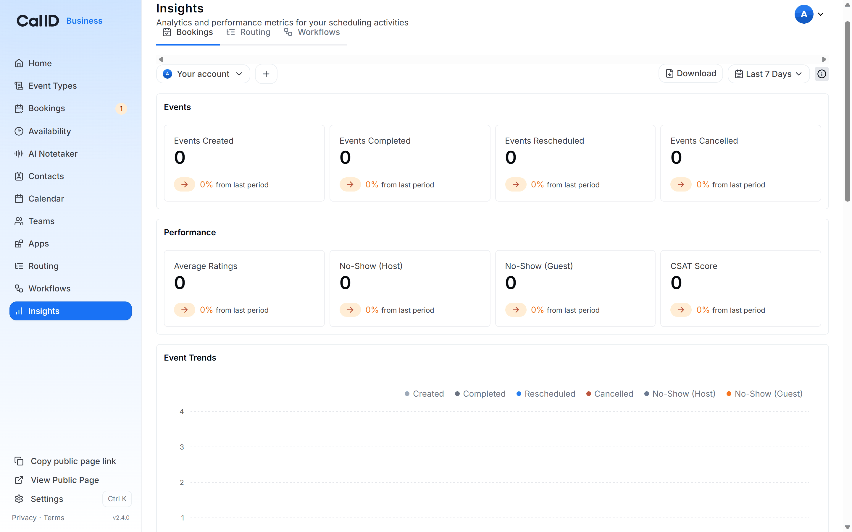
Judging meeting quality and reliability
Graph analysis (event trends)
The central graph provides a visual timeline of your activity. You can toggle data points to see trends for Created, Completed, Rescheduled, Cancelled, and No-Shows over days or weeks.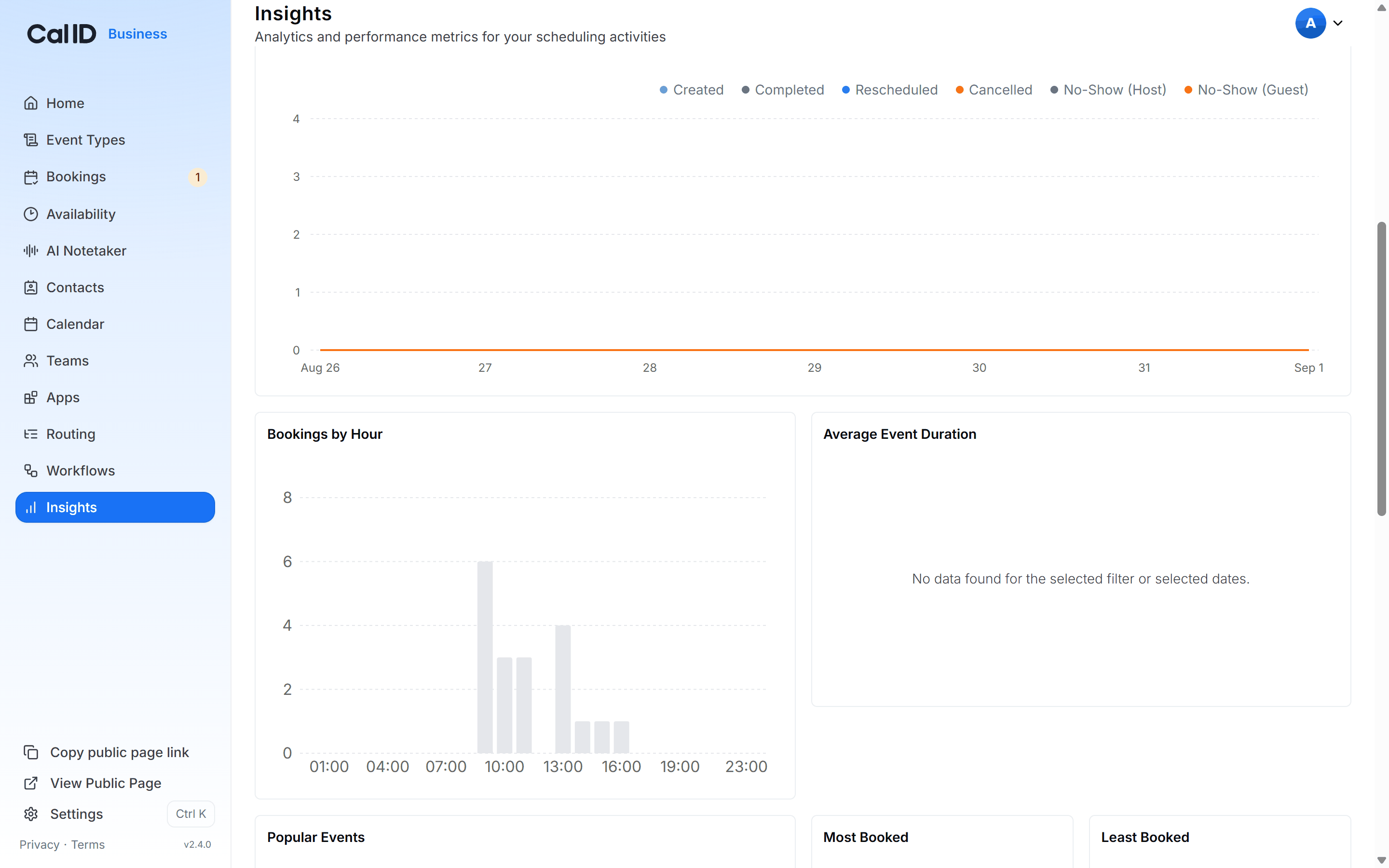
Spotting trends week over week
Deep-dive statistics
Scroll down to find specialized charts for better planning.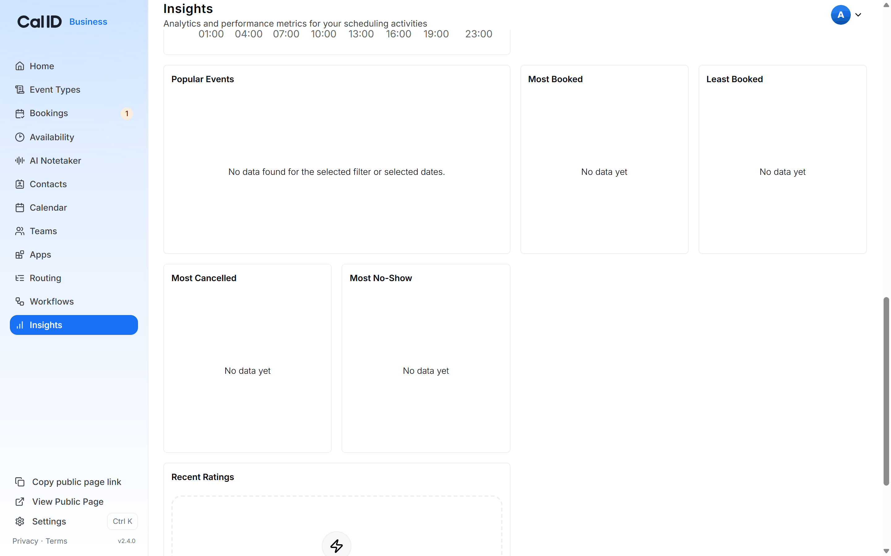
Finding busiest hours and repeat absentees
Filtering and exporting your data
Filters apply to every scorecard, graph, and chart on the page at once. Set your date range and account before reading the numbers so you’re comparing the right period.
- Date Range Filter: Use the dropdown in the top right (Last 7 Days, Last Month, or Custom Range) to focus on specific periods.
- Account Filter: Switch between viewing your Personal insights or specific Team insights using the account selector at the top left.
- Download Report: Click Download in the top right to export your analytics as a CSV or PDF file for external reporting.
Other Insights dashboards
Workflow performance
Confirm your reminders, follow-ups, and notifications are being delivered reliably.
Routing performance
Track how visitors move through your routing forms and where they drop off.